


If you were to ask somebody to describe an iconic logo, the first thing they would likely comment on is the color. The fact is that the shades you use to build a brand do a lot of heavy lifting. They invoke certain emotions and demand attention. In fact, some studies suggest that 87% of consumers will pick a particular product based on the color alone. Yes, it really is that powerful, and you can use it to your advantage! As a Lowcountry branding photographer, I love working with my clients to find ways to grow their brands. If you want to see how to use color psychology in branding, I would love to tell you everything you need to know!
Choosing Color Palettes that Reflect Your Brand
What is Color Psychology?
Let’s start out by diving into what exactly I mean by color psychology before learning how to use it for branding. Basically, this is the theory that certain colors can drive the way people feel about and consume a product. For decades, big brands have been using it to demand instant recognition of their stores. Color psychology is the reason why you might see a combination of purple and teal and instantly start craving a chalupa. Certain colors will make you feel a specific way, from tranquil Starbucks green to bold and brash Coca-Cola red. And those emotions are what drive initial purchases.
Why Personal Brand Colors Matter
But you aren’t a big corporation; you’re a personal brand trying to craft a one-on-one experience. Color psychology will still go a long way in attracting customers to your branding! When people head over to your website, the colors that greet them will tell you everything you want them to know. Maybe your brand is unapologetically feminine yet fearless. A hot pink can convey that. Or perhaps you’ve crafted a warm and cheerful space where you want everyone to feel welcome. Yellow is the shade for you. No matter what you choose, the colors that greet your clients will influence their initial reactions!
How To Use Color Psychology in Your Personal Branding
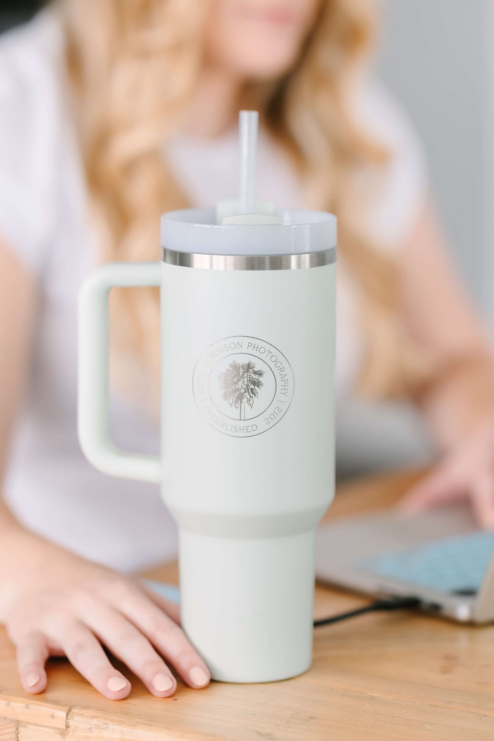
If you want to use color psychology in your personal branding, the first step is to decide the impression you want to make on your clients. For example, when I was choosing colors for KMP, I really wanted to represent the location I love living in. It was important to me to capture the essence of the fresh air feeling when you’re outside and the scenery you’ll find throughout my portraits. So, I purposefully chose colors that you’d find in the natural landscape in the Lowcountry. When you head over to my website, you’ll find the blues of the water or the greens of the trees.
When it came time to plan photos to complete my website, I built my outfits around that palette to create a consistent theme that would carry onto my social media page. If you could use some help building your brand, I suggest spending some time thinking about what you want your clients’ first impression to be. From there, build a custom color wheel matching each hue with the desired result. You can then use those shades in everything from your web designs to your business cards to your branding pics!
I’m Always Ready To Help With Color Psychology in Branding Photos
If you’ve been looking for a way to build your brand recognition, I really hope color psychology in branding helps you out! And if you would like to chat more about planning your Lowcountry branding photo session, I would love to connect! Send me a message today so we can get the conversation started!
- 5 Ways You Will See The ROI Of Personal Branding Photography
- 6 Tips For Your Personal Branding Session In The Lowcountry!
- 5 Fantastic Ways To Use Personal Brand Photos In Your Business
Have you joined my email list yet? If not, let’s connect!


leave a comment!